The introductory assignment to working in 3D in Adobe After Effects for my Graphic Design course. Due to not having too much other work to do, I ended up going above and beyond what was required for this assignment and am proud of the result.


Technically multiple projects, I created two can labels for a local beer brewery. I chose Stray Dog Brewing Company, as it's one in the area I grew up in, Orleans, and simply because I like dogs. I initially wanted to create labels which tie in to the brewery itself, but we were tasked to make labels based on specific landmarks/locations from the greater Ottawa/Gatineau area. Before choosing locations however, I visited the brewery in person to get a sense of the brewery's culture, identity, and values.
What I got from my visit and talking with one of the two founders (as well as the website) is that Stray Dog Brewing Company is one born from a desire for independence. They started the company because they wanted to be their own bosses, and out of shared interests like indie bands and good beer. They also pride themselves on making beers that are high quality and different from what you might find at The Beer Store or another big name retailer.
With that in mind, I created my beer labels based on two locations that tied back to the area and the values of the founders. Dime a Dozen is based on their pedigree, having awards with their beers or at least placed quite high at local beer brewing competitions. The location being the Royal Canadian Mint, which is recognized for its outstanding quality of coin production but on a global scale.
The other is Bog Hops, which is based on the Mer Bleue Bog located just south of Orleans. It reflects the rugged, independent side of the company while also being an important landmark in the area as a crucial habitat that resisted attempts to destroy it for city development. To top it off, the bog has ingredients growing there natively which could be used to give the beer a unique flavor, such as Cranberry and Blueberry.
For both, I had the idea to create universal branding across can designs by having a graphic along the bottom that resembles a dog's collar.
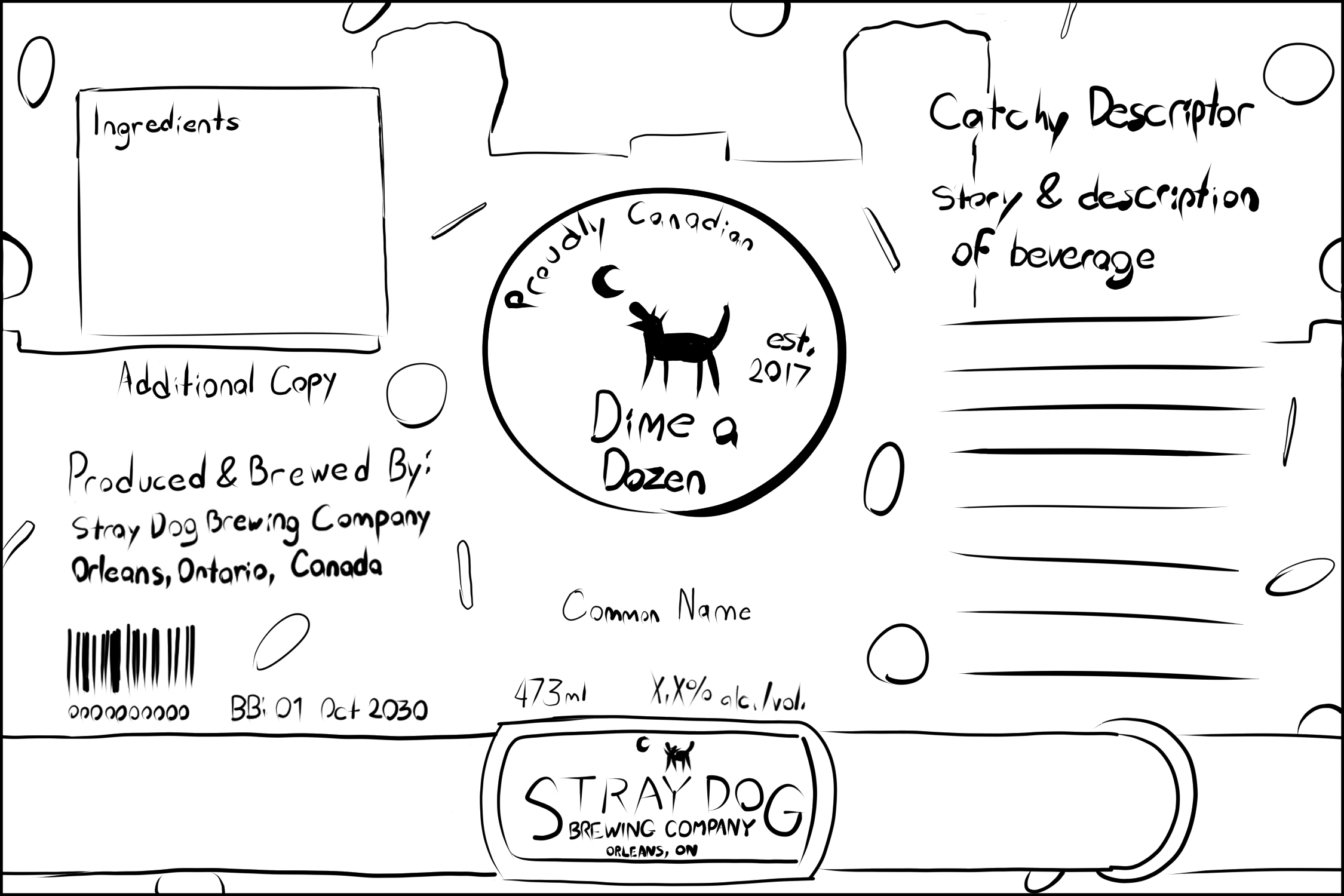
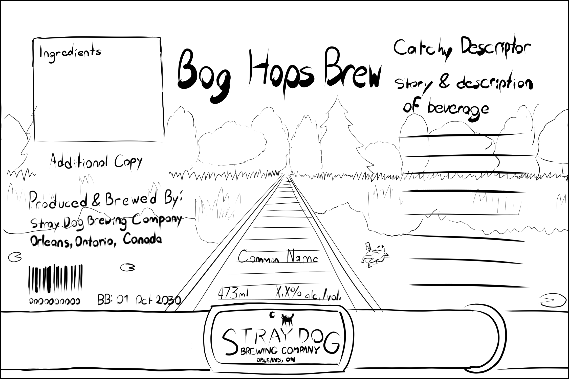
Once I had solidified the concepts I sketched out I went into Adobe Illustrator to create the finalized labels. I used mostly flat, bright colours to match the collar on both, with relatively simple shapes similar to their logo.
Once the logos were finished, I brought them into Photoshop as well as Cinema4D in order to put them on 3D models of beer cans in order to create mockups.
Later, when I was to create marketing for the beer cans, I modified the can labels in order to separate them into layers for animation in After Effects. I then created some more assets in Illustrator, including a vectorized version of the company logo, to put together short motion ads for social media in a vertical format.
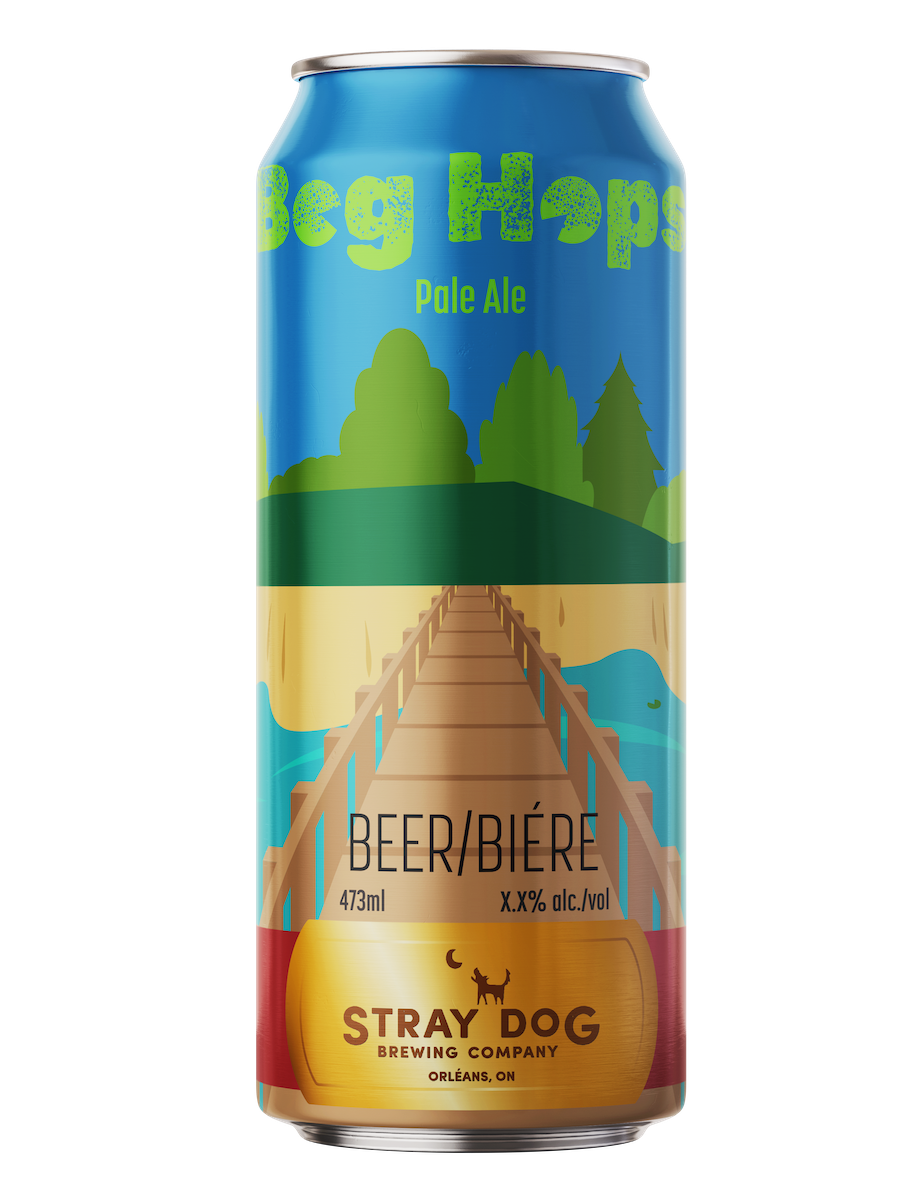
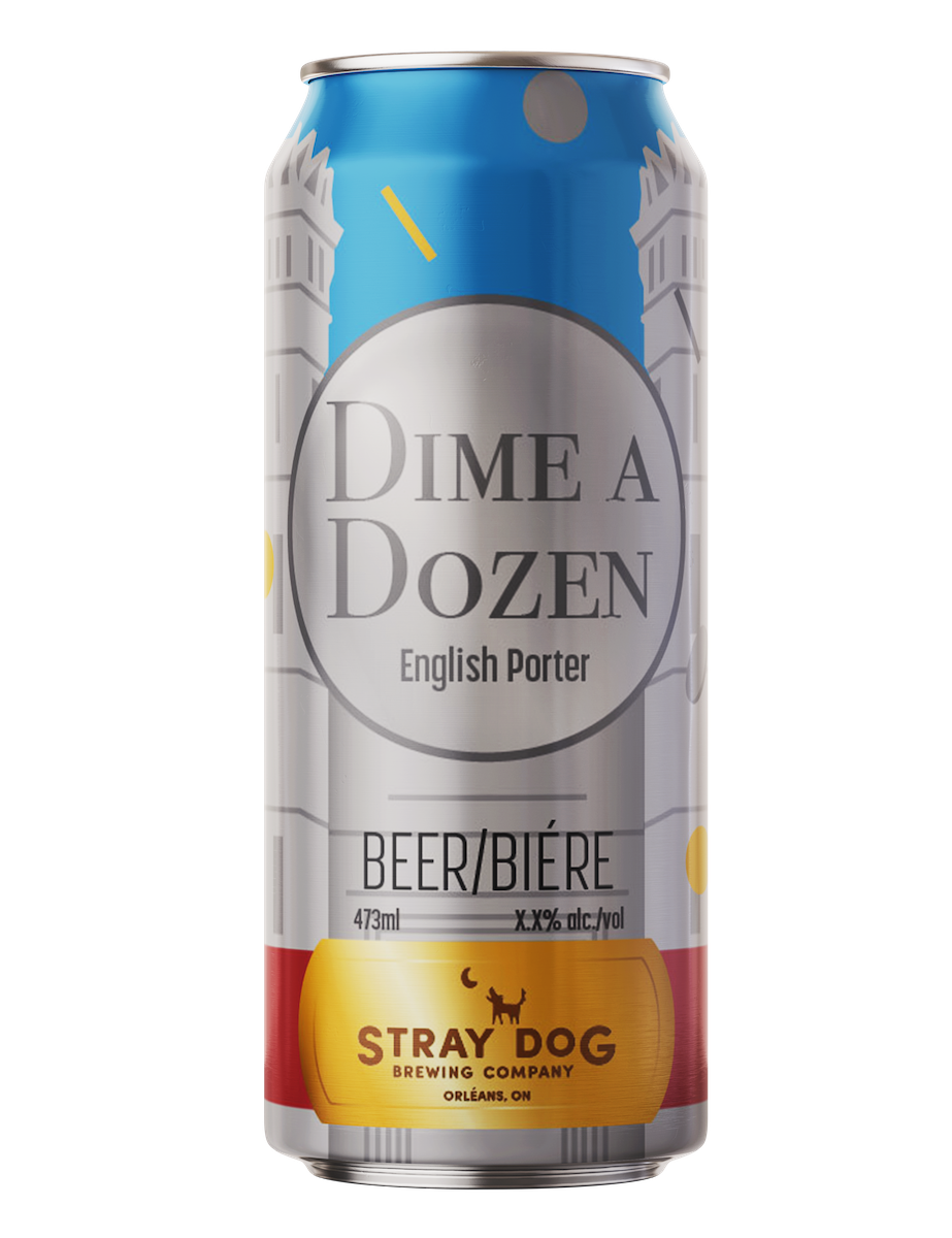
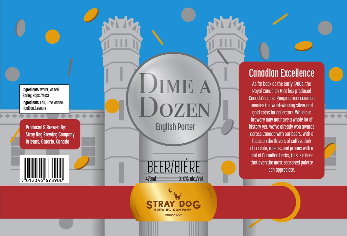
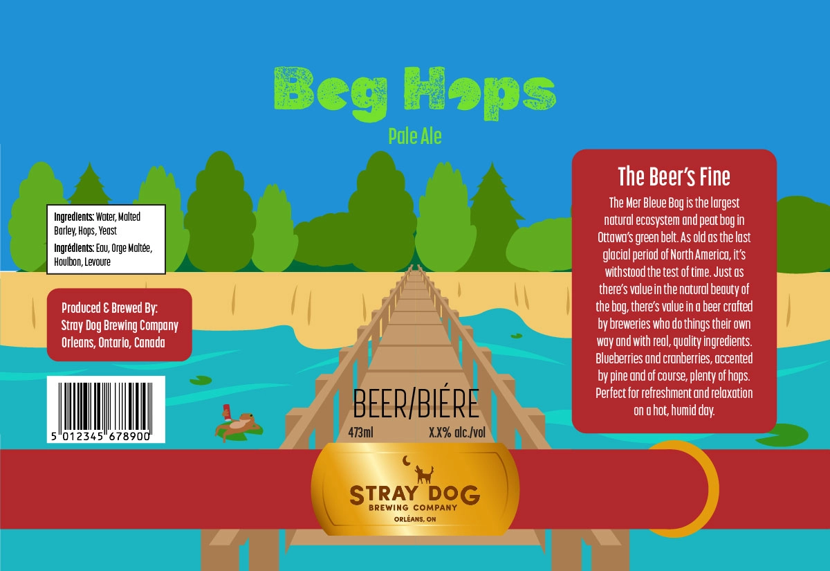


While I unfortunately didn't have as much time as I wanted to create the can labels due to my original concepts being rejected, I still think they ultimately turned out well. In particular the collar on the can as recognizable, universal branding fixes an issue Stray Dog Brewing Company has with a lack of consistency in their can designs. I also think the branding at the end of the motion ads, with the dog barking, is a good use of the company logo.