The final assignment for my second semester of computer graphics, I used basic shapes with effects and gradients to create a poster that relatively simple, but effective in conveying the power of a black hole.

This project was one in which we had almost complete. All were tasked with doing was making a vector art poster in Illustrator. While thinking about what kind of poster I wanted to make, the thought came to me to use space as the subject. It's something my brother is very interested in and there are numerous beautiful photos of space to serve as inspiration.
I also wanted to make use of some of the tools we had learned in the program. I came to the decision to make a black hole the primary subject, as I wanted to see what I could do with the "Swirl" effect.
Having such a strong mental image of what I wanted to make (and having other assignments I needed to give time to as well) I skipped making any sketches or guidelines and went straight to creating the vector art. I started with the focal point, the black hole. It was quite simple to start with, simply using circular gradients to create the image of a black hole and the nebulae on the top and bottom of the poster. Once I started creating the accretion disk itself however, things got more complicated.
My initial idea was to make duplicates of a shape in a radial pattern and then use the swirl tool to make them look like the accretion disk. The swirl tool didn't do enough however, so I needed to use it multiple times over and apply other effects in order to get it looking more or less how I wanted. All of these effects on top of each other were very computationally expensive which slowed down my computer a lot, and this went even further with the stars in the background which required multiple layers of effects on top of hundreds of objects.
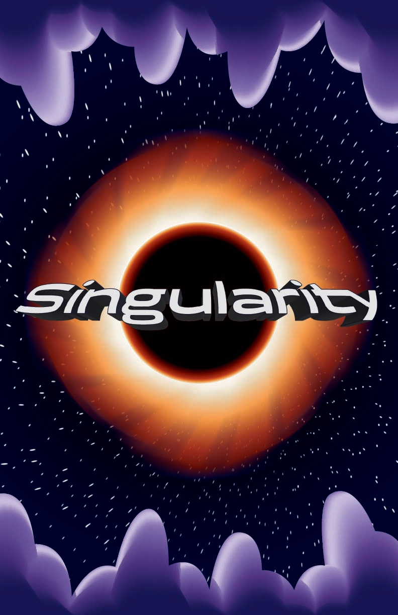
Considering this project was a relatively small one without much planning behind it, I think the poster turned out pretty well. It shows how relatively simple shapes in vector art can still look interesting with good composition and some well placed effects and gradients. With what I've learned and a bit more time I probably could make a much better version of it, but I still think it's a good demonstration of what I can do with vector art.