For my placement in my Graphic Design program, I ended up working with Victory Arts to create a short educational animation aimed at children. I illustrated it in the style of a child's drawings to match, so it all looks like crayon and pencil on paper.


My placement project with Victory Arts was meant to be something educational aimed at children. These days kids are unfortunately subjected to a lot of AI generated garbage which is low effort and doesn't have any educational value or artistry, primarily through Youtube. While children's content wasn't my first choice for placement work, I'm glad I got to do a motion piece and if kids end up watching the series my episode is a part of instead of AI generated cat videos, I can be proud of it.
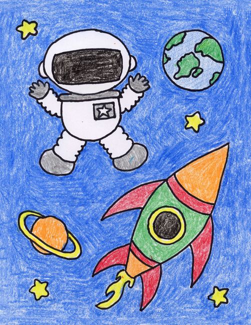
We were given a significant amount of freedom for the style of the animation, the only requirements being it's of course kid-friendly and that we follow the script. The script I got was about a spaceship that gets lost. Space and astronauts are something kids commonly draw, and I'm fairly accustomed to a piece of software that would allow me to create natural looking drawings digitally, so I went with a drawn crayon style reminiscent of what children might make.
Since this was only a two week assigment, I decided to keep things relatively simple and do the majority of the animation in After Effects, rather than frame-by-frame. It also occurred to me from the beginning that at my current skill level and with how much time I had I'd need to keep the art relatively simple.
I started off drawing the assets and adding flat colours in Photoshop, then brought them into After Effects to put together the composition. I realized while working in Photoshop it wasn't ideal for animation, so I moved to Krita in order to animate the Butterfly, starting with a sketch of the simple shapes of the wings and then adding the details. Once all the assets were done I added texture and a background to create the illustrative style, the text explaining how metamorphosis works, and finally animated all the elements that needed it and a few effects for things like the passage of time.

Aside from the particle effect on the shooting star which didn't quite turn out how I envisioned, I'm satisfied with how the project turned out. The use of effects on the assets to make them more animated and the textures on the background and drawn elements all gives it an authentic look.
My feelings on the art style are a bit mixed because I intentionally made it rough and shoddy looking in some ways in order to better sell it being a child's drawing, but it doesn't fully demonstrate my illustration skills. It gave it a distinct look from the other episodes being done by other students at the same time though, so it accomplishes what it's meant to.