The introductory assignment to working in 3D in Adobe After Effects for my Graphic Design course. Due to not having too much other work to do, I ended up going above and beyond what was required for this assignment and am proud of the result.


This project’s goal was for us to learn how to use 3D depth and manipulate the camera in After Effects. As a secondary goal, we were also to make our own vector art for the short animation, which we were to make in Illustrator.
Having previously worked with Adobe Premiere Pro before entering the program I felt pretty confident in my ability to animate it. Alongside that we were nearing the first mid-term break and the other classes were winding down with us already having completed most of our assignments. With those things together I decided to put in extra effort on this project and aim for something equal to the demo, but with the setting being an ocean rather than a rainforest.

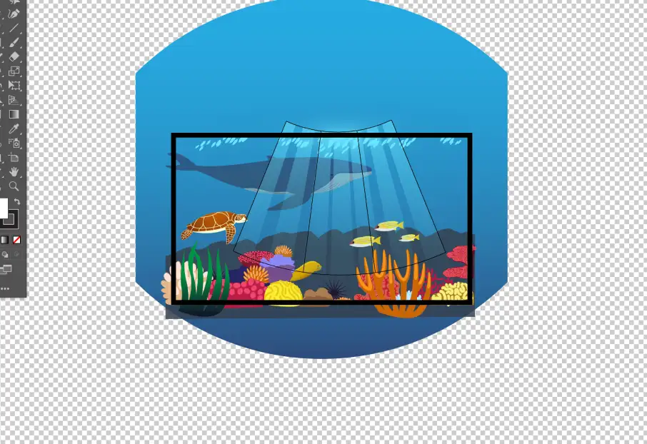
I essentially just jumped into the process of creating the assets, not doing any sketches or wireframes as at the time I didn’t have a drawing tablet and didn’t think drawing on paper would be time efficient with how I’d have to make every individual asset in Illustrator. I hadn’t worked a lot in illustrator up to this point and so didn’t work very efficiently, especially with the coral, but I put in the time to get it to where I thought it was good enough. I also based all of the coral on real coral I could find photos of, so it’s stylized but grounded in reality. I also made use of various effects in order to animate a few elements like the seaweed and whale, and finally added some sound effects in Premiere Pro after exporting it from After Effects.
The final result is the foreground is colourful but still somewhat realistic. I added in a few sea creatures, choosing a turtle for how the pieces of its shell and skin translate well to vector art and an eel to sway in the ocean current and add more movement. The whale in the background which was given a blue hue to show that it’s further away then the rest. Finally a blue, bumpy shape represents the edge of the rocky outcropping that defines the border of the reef, with detail obscured by the water, and the water is given a natural look with a subtle gradient showing the light from the surface fading lower down into the water.

I’m quite happy with the final result, and while it’s definitely not perfect I think I went above what was expected for a project we only had two weeks to work on. I became much more proficient in Illustrator thanks to the work I did on this, and while I could’ve worked smarter instead of harder I’m much more capable of creating the specific shapes I want with paths. The only feedback I got was I could’ve put the layers further apart to exagerrate the depth more, and that the effects on the seaweed could’ve been applied to more elements to enhance the motion aspect.