A project where we were tasked to make multiple pieces for a local non-profit. I chose an organization that focuses on supporting Canadian veterans, who in recent years are not getting the assistance they desperately need.


This project gave us a lot of creative freedom, but the ultimate goal was to make a couple different pieces for a campaign to promote a non-profit. I chose the Navalis Foundation as supporting veterans is a cause I think is underrepresented in recent years, and more attention needs to be brought to it. All of them would be directing people towards donating to the foundation.
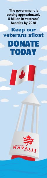
When it came to the type of pieces to create for the campaign, I chose to do a variety. A poster and a bus ad which could reach people in the real world, and two web ads to reach people online. A lot of potential donations could come from older people who may not use the internet as much, so I figured doing print ads was important, but I also wanted to reach younger audiences who don't generally get shown campaigns like these.
Once I had decided on the format I had to think of how I would convey the message, and what that message was. The moment that made it click in my mind was combining the message of veterans needing help with the foundation's name and history being closely tied to Canada's navy. I came up with the slogan "Keep our veterans afloat", and from there went with the imagery of a life raft or broken down navy boat needing rescue.
With this in mind I sketched out concepts for each piece, fitting within the aspect ratio required with naval imagery and room for text and other elements. I also made sure that the print pieces had room for a QR code which could be scanned to go directly to a donation page, as online donations are far more accessible with how ubiquitous smartphones now are.
Finally, I got to building all of the pieces in Illustrator and used them to create the mockups. I used a relatively bright but limited colour palette in order to have it be somewhere between current popular vector art styles and old military posters.
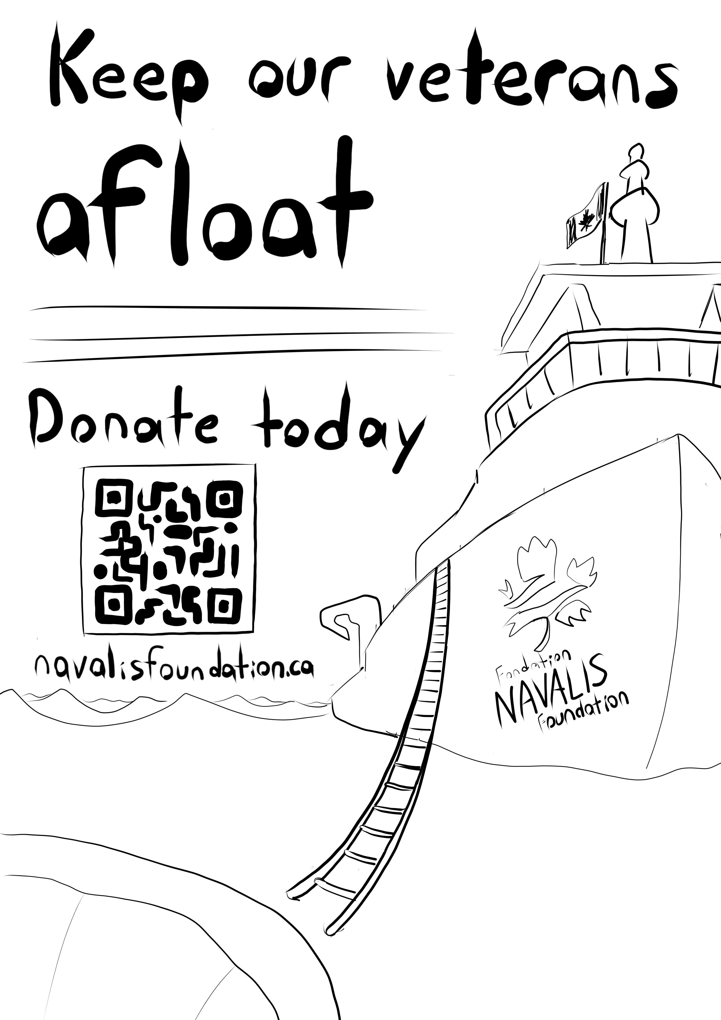
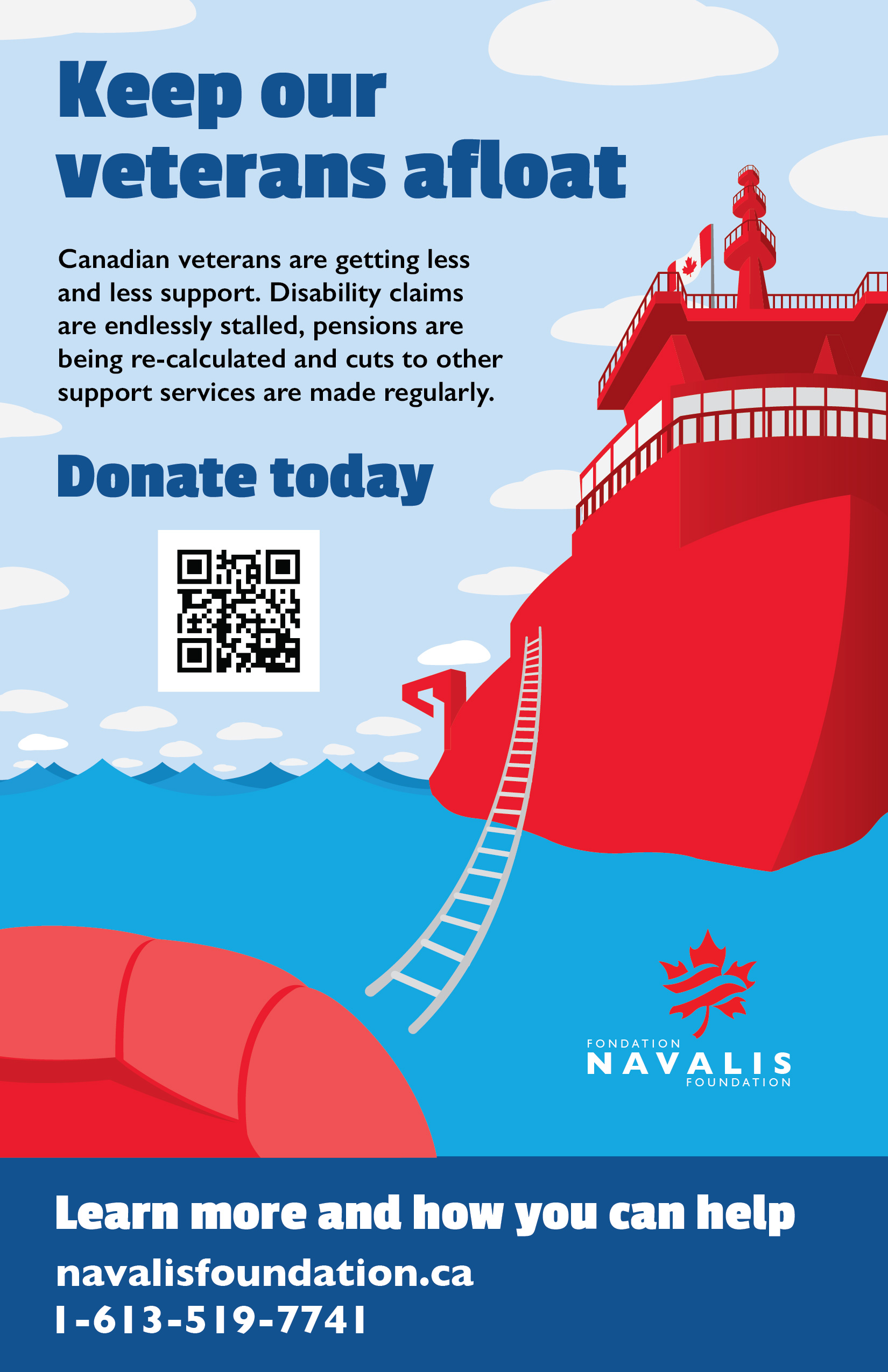
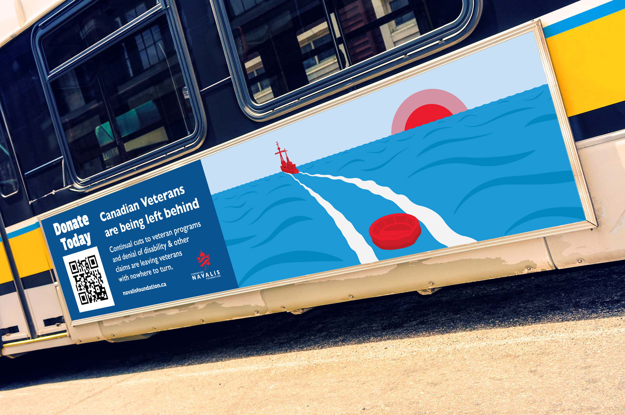
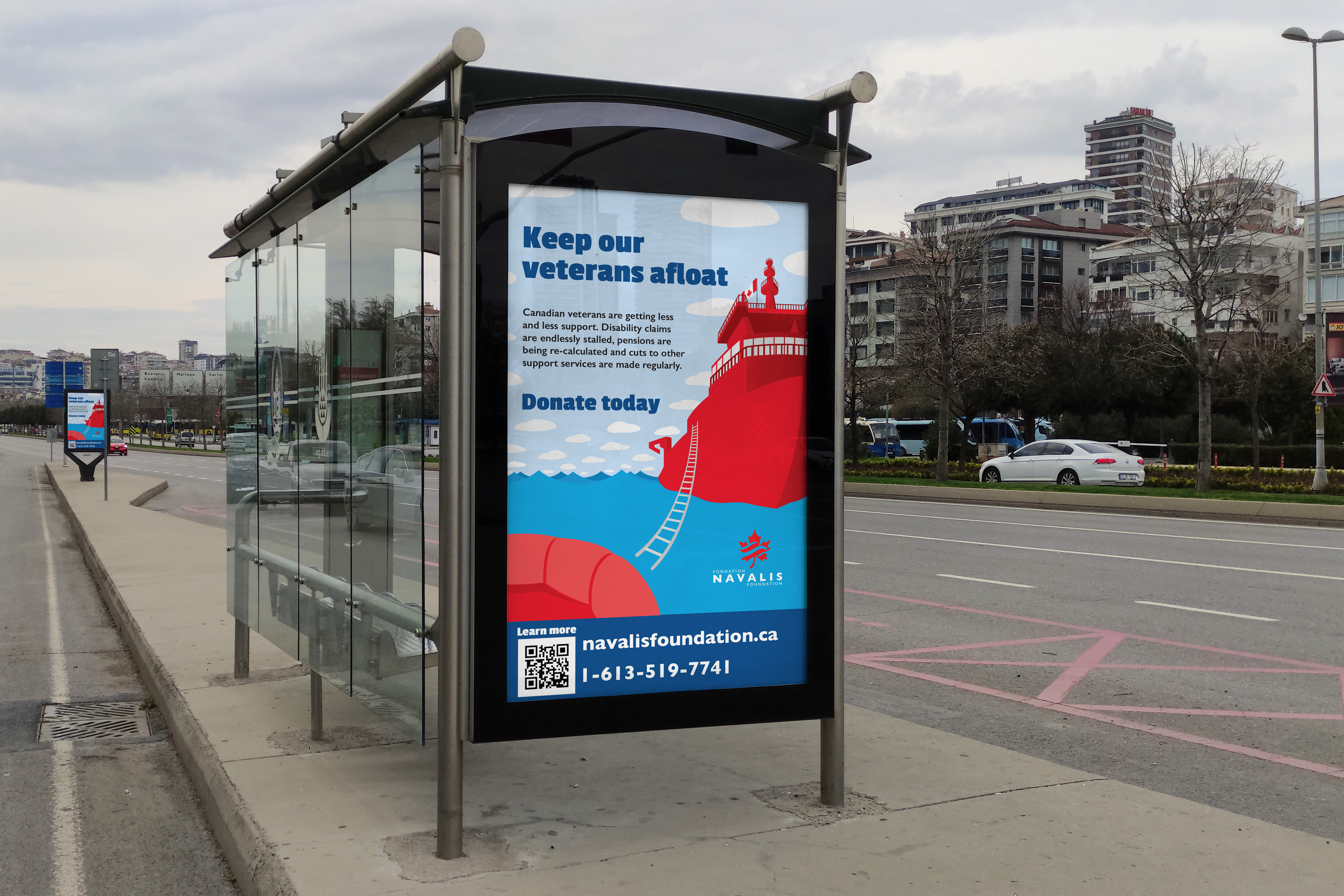
It took me some time to settle on the direction for the campaign, so I couldn't quite make the vector artwork as detailed as I would have liked. Despite this I'm overall happy with the pieces, they all work nicely together and effectively communicate the message they need to.