Our first project in UI/UX, learning how to put what we'd learned in Figma to full use. I found and chose a pizza website which was bad intentionally, but to the point it negatively harmed the usability. Balancing the style with usability made it an enjoyable challenge.
For the first assignment in UI/UX, we were to redesign a website that was in desperate need of one over the course of several weeks. Initially I was having a hard time deciding what to choose, one of our professor's words about having fun with our work came to mind, and I decided to go out of my way to look for a website so bad it was laughable.
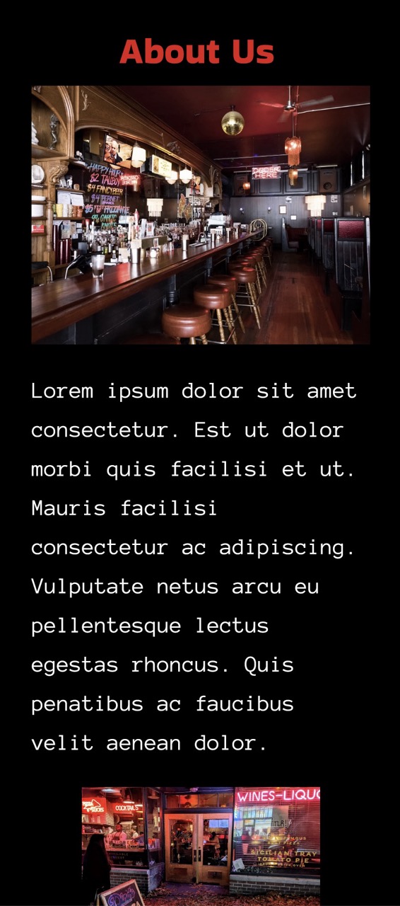
While I can't remember exactly how I found it, I set out to find a website that was reminiscent of the late 1990s/early 2000s style popularized by Geocities. What I ended up finding was a website for a Pizza restaurant called Dinos Tomato Pies in Seattle. I liked the style, but it was clearly out of date, so I set out to redesign it in a way that didn't sacrifice its identity while improving usability.
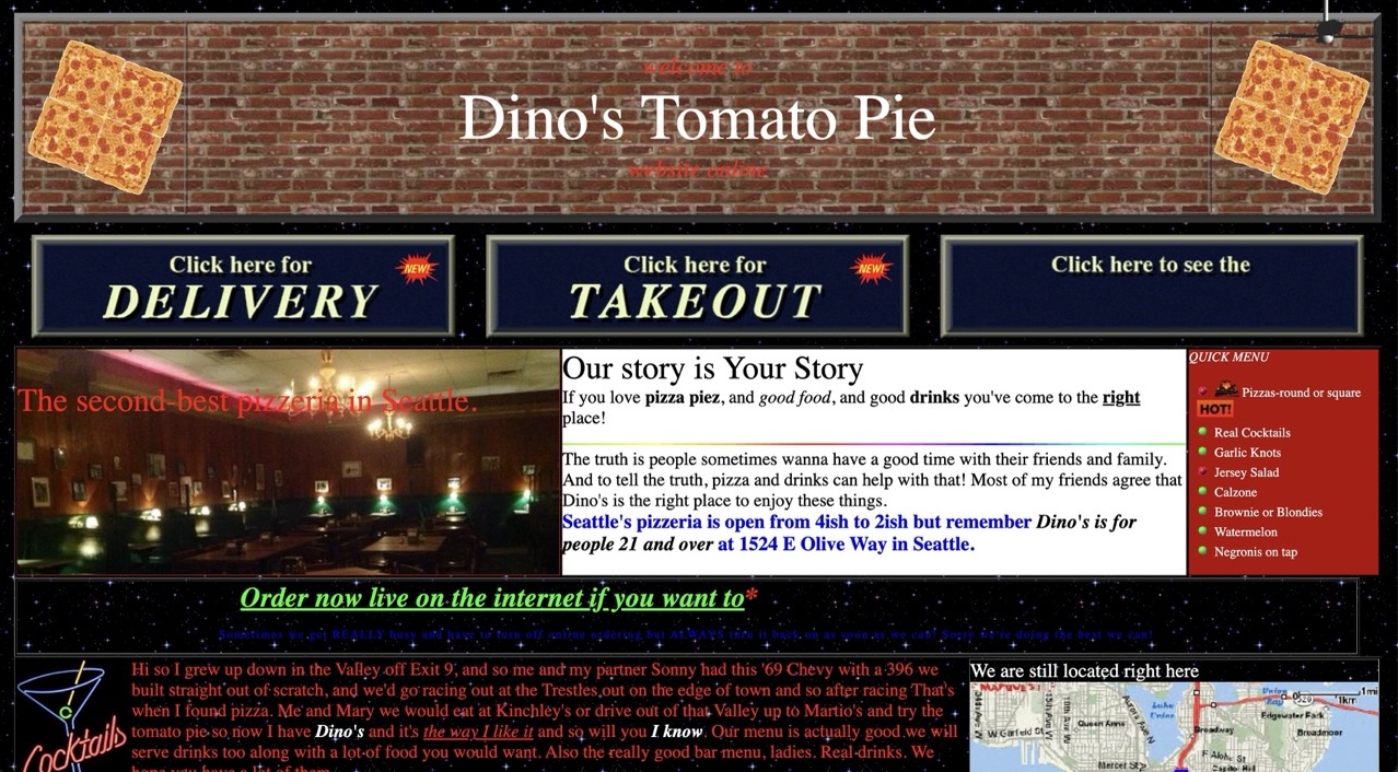
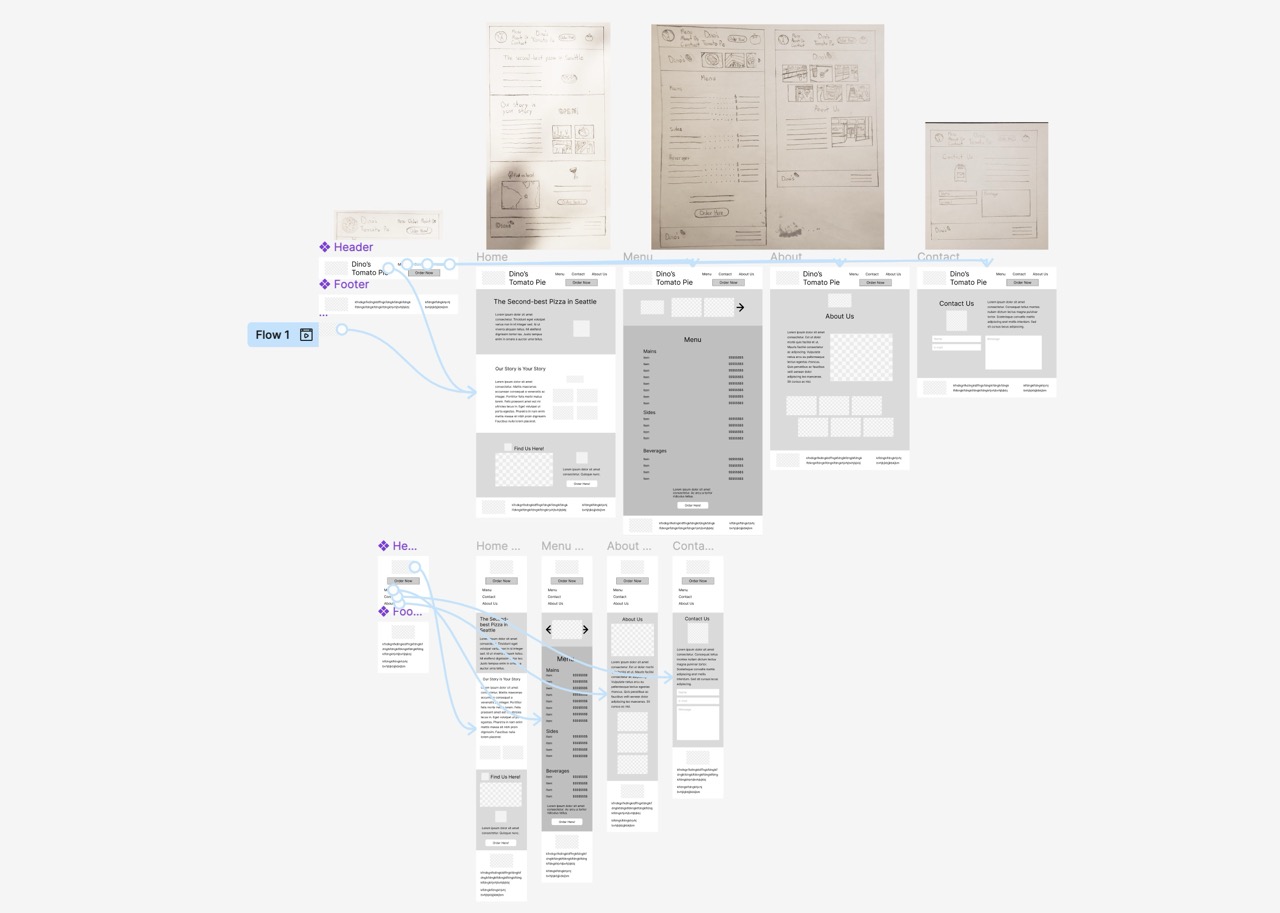
The first few weeks had us doing analysis of the site and creating personas of the kind of person who would use the website. This felt like more of a formality than anything as the website was so obviously bad, but I did come away with a good idea of the color scheme based on photos of the restaurant and a general theme of black against bright colours reminiscent of neon signs. Once we got to brainstorming for the new website I really got into it. When it came time for sketching our layouts, I went into it with imagery in mind as one of the key aspects of the style I wanted to maintain was the use of old, cheesy GIFs. What I frequently ended up doing was thinking about what key elements of the website would be complimented by them, and laying out pages to have space for the GIFs where I could.
Then came creating our mockups in Figma. I was already quite comfortable in Figma so the low-fidelity version was little trouble for me. The high-fidelity version was another story, mainly just due to how many GIFs I had planned for when sketching it. What I didn't account for was how tricky it would be to actually find fitting and appropriate gifs, as we didn't have nearly enough time to create more than one or two custom assets nor had we learned how to make them. I ended up spending quite a lot of time scouring the internet for GIFs that suited my needs, and they weren't ideal, but imperfection is part of the charm for this style so it worked out.
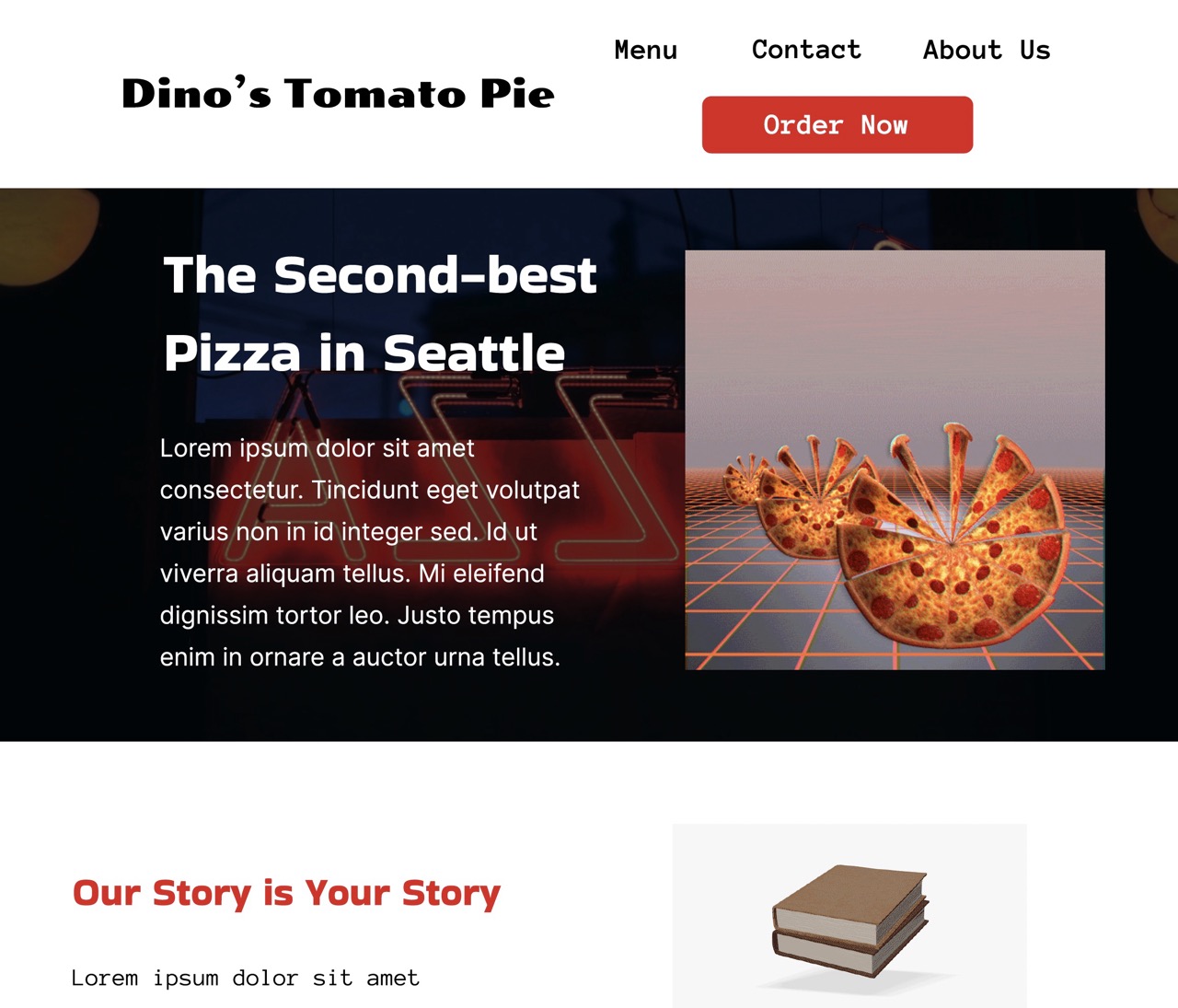
While it isn't fully where I wanted to be, I'm satisfied with how the project turned out. I set out for it to be something fun to work on, and I think having fun with it helped my productivity in the end. Though at the same time I ended up spending more time than I probably should have looking for GIFs, many of which ended up not getting used in the end. If I were to re-do the project and had more time, creating custom assets for the website to really give it a unique identity would really enhance it. All in all though, it's still a clear improvement over the original.